Nearcut · UX Design Lead · 2020–2021
Rebuilding the UI of a B2B booking platform for barbers
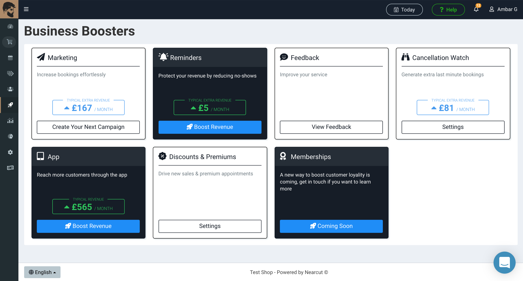
As sole designer, working directly with the CEO and developer, I rebuilt the UI system from scratch — creating components, layouts, and a coherent visual language, and implementing responsive designs for desktop, tablet, and mobile across a B2B SaaS platform.
Context
Nearcut is a booking and business management platform for barbers, hairdressers, and therapists. It allows shop owners to take bookings online, manage their time and staff, and market to customers. An industry leader in online booking for its market.
Problem
Internal pages lacked a coherent brand identity and consistent UI components. There was no unified UI kit, layouts varied between sections, and the platform was poorly optimised for mobile and tablet. The goal was to reduce the need for customer support when using the app and push the subscription model through better usability.
My Role
- Sole UI/UX designer working closely with the CEO and developer
- Identified user issues and navigation problems through research
- Created personas and established user goals and needs
- Designed homogenous UI components aligned with the brand
- Built page layouts for each section with its respective user needs
- Improved UX navigation across the platform
- Adapted all designs for desktop, tablet, and mobile (responsive)
- Frontend implementation: HTML, CSS (SASS), JavaScript interaction prototyping
Process
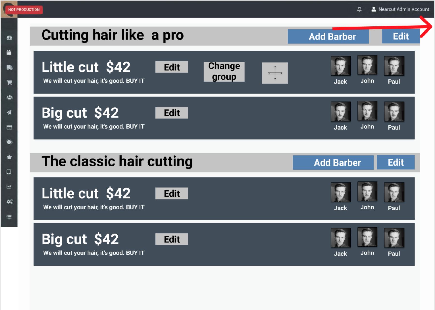
I began by auditing the existing platform to identify inconsistencies and navigation friction points. Working from personas developed around the typical shop owner and their employees, I established goals and mapped the key tasks they needed to complete.
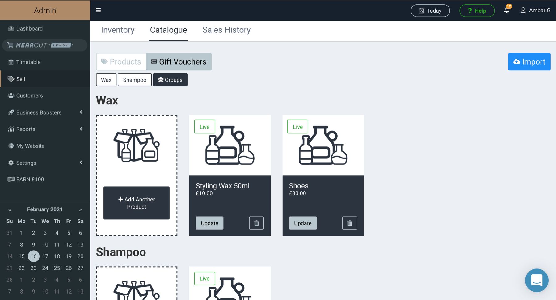
From there I built a UI kit — standardising components like buttons, forms, tables, and navigation elements in line with the Nearcut brand. Each page was then redesigned using these components, with layouts tailored to the specific needs of that section's users.
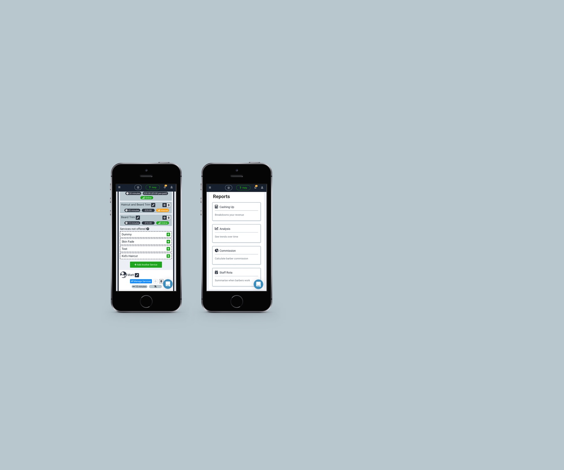
Responsiveness was a key constraint throughout: every layout had to work across desktop, tablet, and mobile, with the barber shop context in mind (owners often checking their schedule on a phone between clients).
Outcome
- Consistent visual identity across all internal pages
- Improved UX navigation reducing confusion and support burden
- Fully responsive layouts for desktop, tablet, and mobile
- UI kit established as a shared design foundation for future development